Design Principles Document
Marvellous Okafor
Visual Hierachy
Walmart
walmart.com
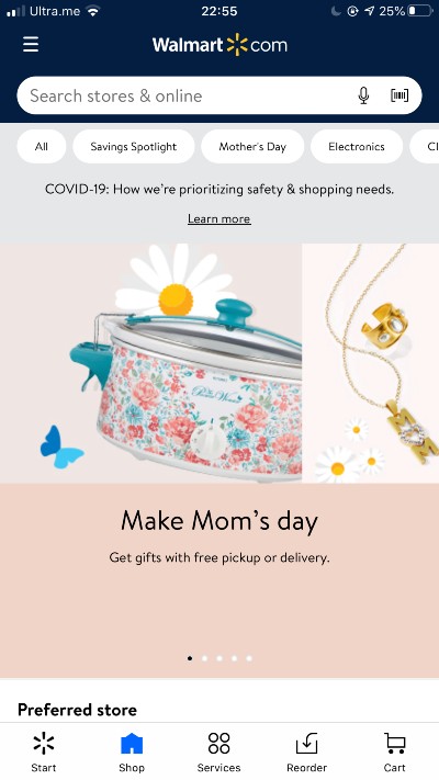
Visual Hierachy is the order in which a user processess information on a page. This also help a user understand information easily. It can be asigning larger fonts to headings or using color to show emphasis. In the website walmart.com, one can clearly see that you have special items at the center of the page for Mom's day which tells us that Mother's day is approaching so if a person comes to walmart to buy a gift for his mom, they made the job super easy. You can also see that the categories in the page are covered in white background and are smaller than the central page. one can see the colors on the search bar and how it is different from the rest of the page. If one comes and needs to search, he can clearly see the "search stores & online" in the search bar. They are using Visual Hierachy properly.
Repitition
Brigham Young University-Idaho
byui.edu
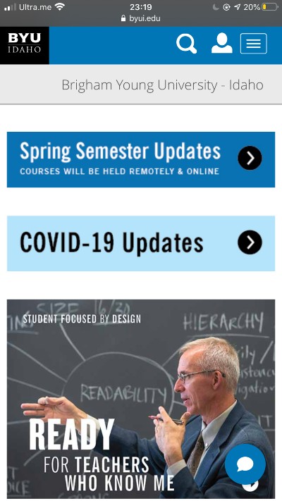
Repitition is simply the process of repeating elements either thorugh design or several pieces of design. There are different ways to apply repitition in webpages. You can do it through fonts, images, graphics, shapes and much more. The most important thing is consistency. Byui.edu webpage shows repetition in shapes that they have on their homepage. The BYU-Idaho logo is in a retangular box, the navigation panel is rectangular, the title "Brigham Young University - Idaho is in a rectangular box, Spring Semester Updates is in arectangular box, COVID-19 Updates is in a rectangular box, and many more as you scroll down the page. You can see that the rectangular box is being repeated consistently. Imagine if these shapes were random shapes!
Hick's Law
Amazon
amazon.com
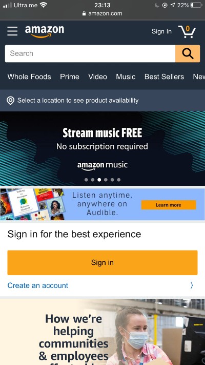
Hick's law is simply the idea that the more choices you present users with, the longer it will take them to reach a decision. As designers, we want our users to take less time finding what they want in a website because it improves speed of service and reduces confusion. In amazon.com, their website obeys hicks law because the options at the top includes whole foods, prime, video, music, best sellers. They also have a search bar which is at the top and makes it so that a user will be able to quickly search what they want. They also have the option to select your location to see what products are available in your area. It's no wonder that amazon is one of the richest companies in the world.